A Collection of Landing Page Designs
This is a collection of landing page designs and redesigns I have completed over the last couple of years. The majority of these take existing pages and bring them back from the grave to an update in line with the rest of the current site style. Let's take a walk through a couple of the briefs and the results.
BRIEF -- to take the old welly care guide page and bring it up to date with a more modern design that still fits into Joules' brand style.
The Welly Care Guide as self-titled provides customers with information about how to care for a staple product the business sells: wellies.
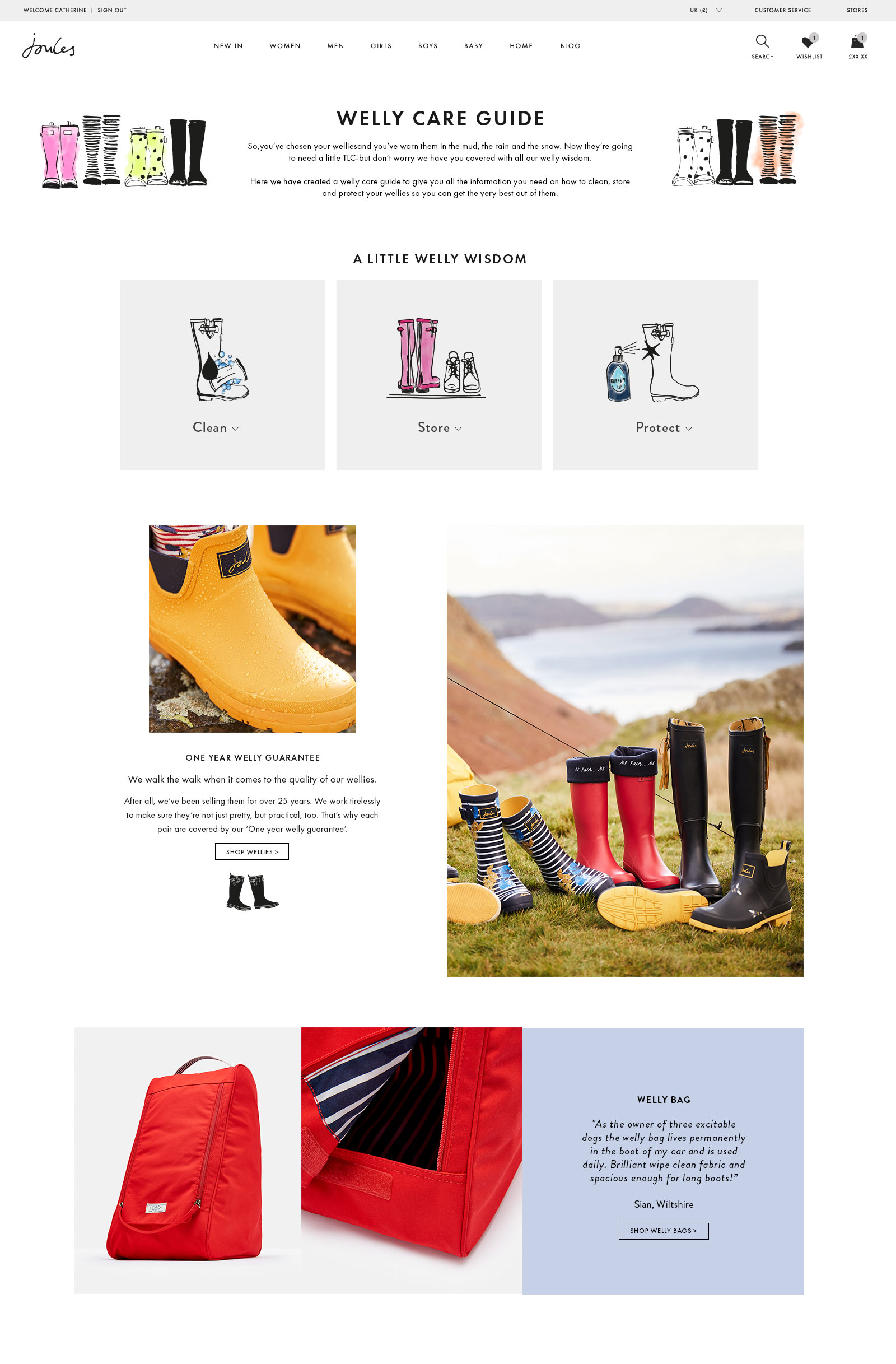 The original welly care guide design.
 This redesign took the old page design (see below) and tore out the dated looking illustrations to replace them with up-to-date photography and a consistent colour palette throughout. The page had some main functionality that needed to be retained, such as the clean/store/protect information which is good for SEO and customer knowledge, which was revamped and placed into an accordion style dropdown to reduce page length and still sit in the initial view port.
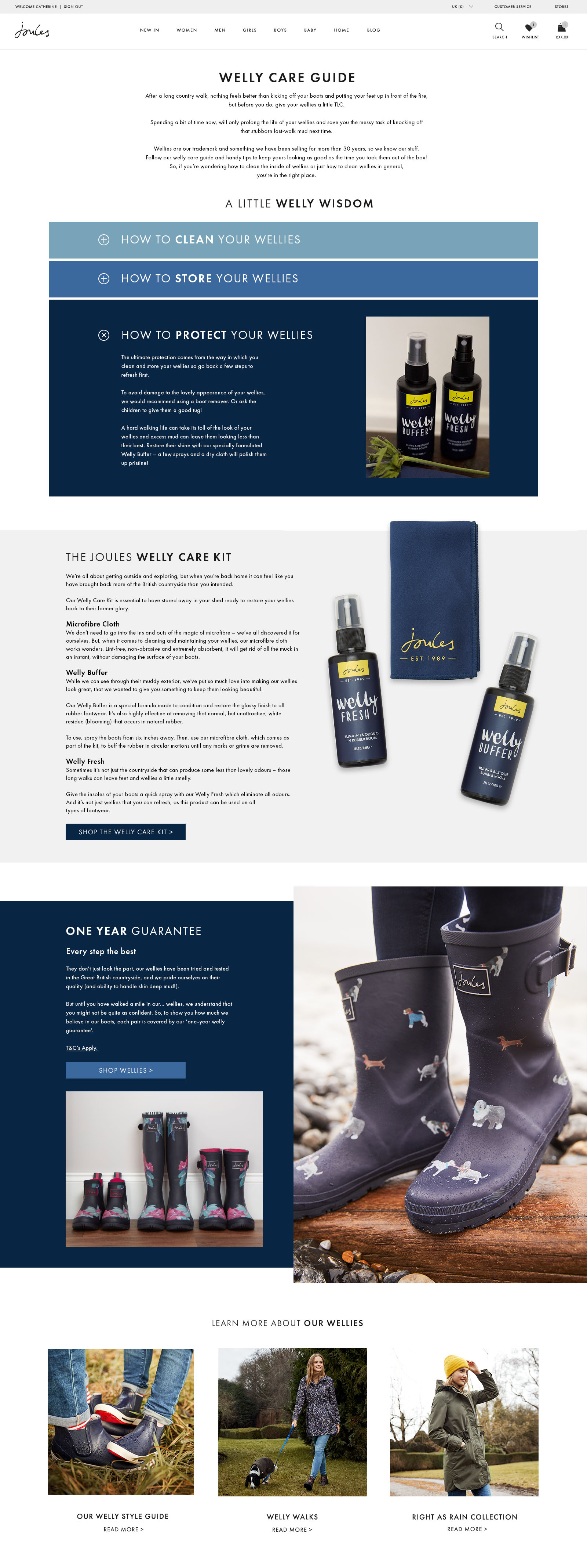 The new welly care guide design.
 The new page design was built again with the knowledge that it will be refreshed every 8 weeks with new imagery - so with that in mind I kept specific product lifestyle shots to key locations thus making the refresh process faster and more streamlined. The responsive version is below:
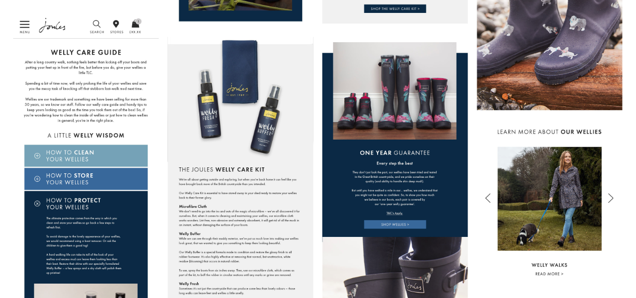 How the design responds down in size.
 Let's look at another page.
BRIEF -- a small project to redesign a page which showed customers our blog posts and up-coming collections of products which, like the care guide, was refreshed every 8 weeks.
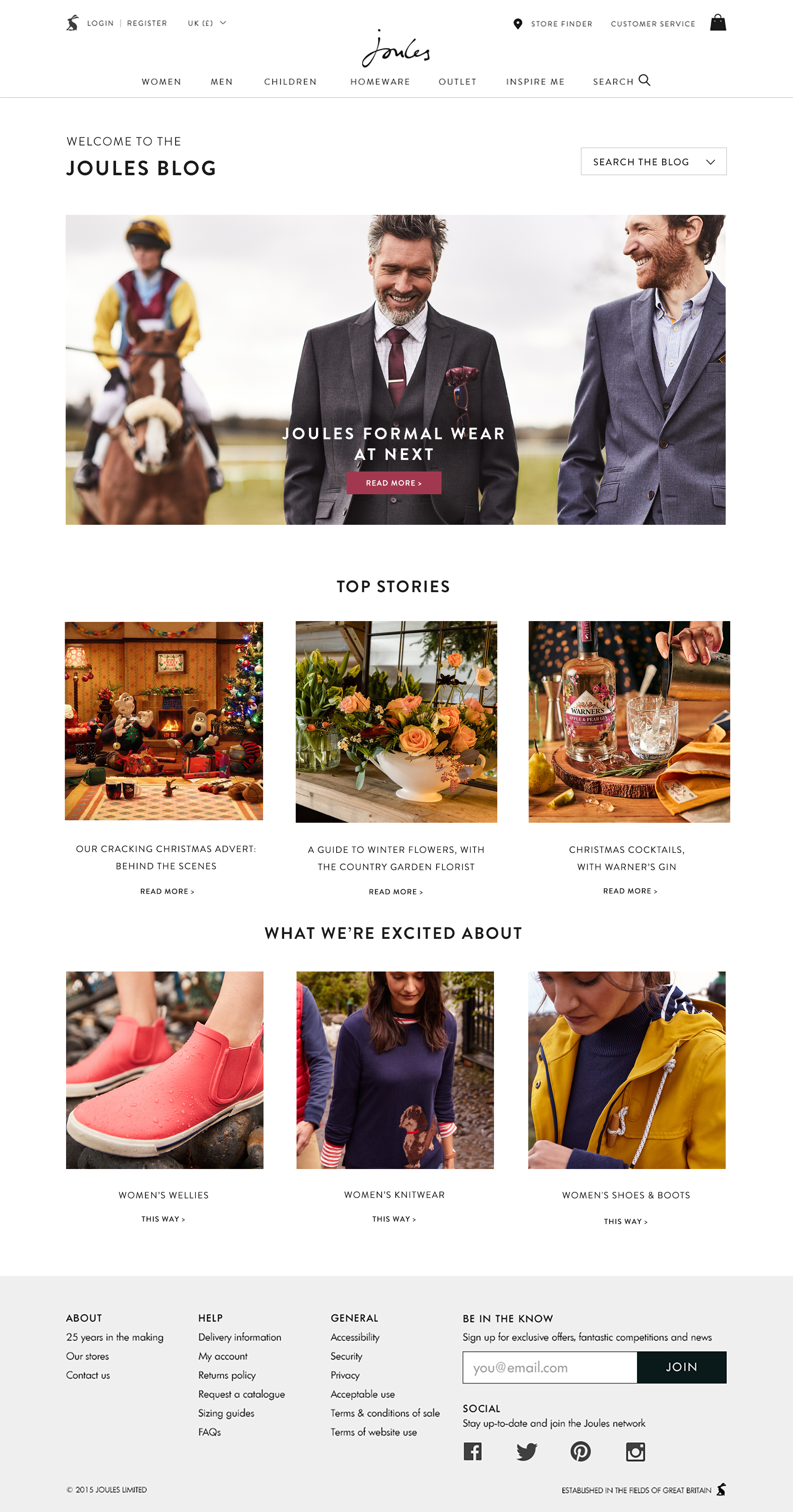 The original 'Inspire Me' page.
 The main appraoch to the redesign of this page was to improve it's UX and provide a nicer experience for customers, allowing the company to show a wider breadth of inspirational product and content.
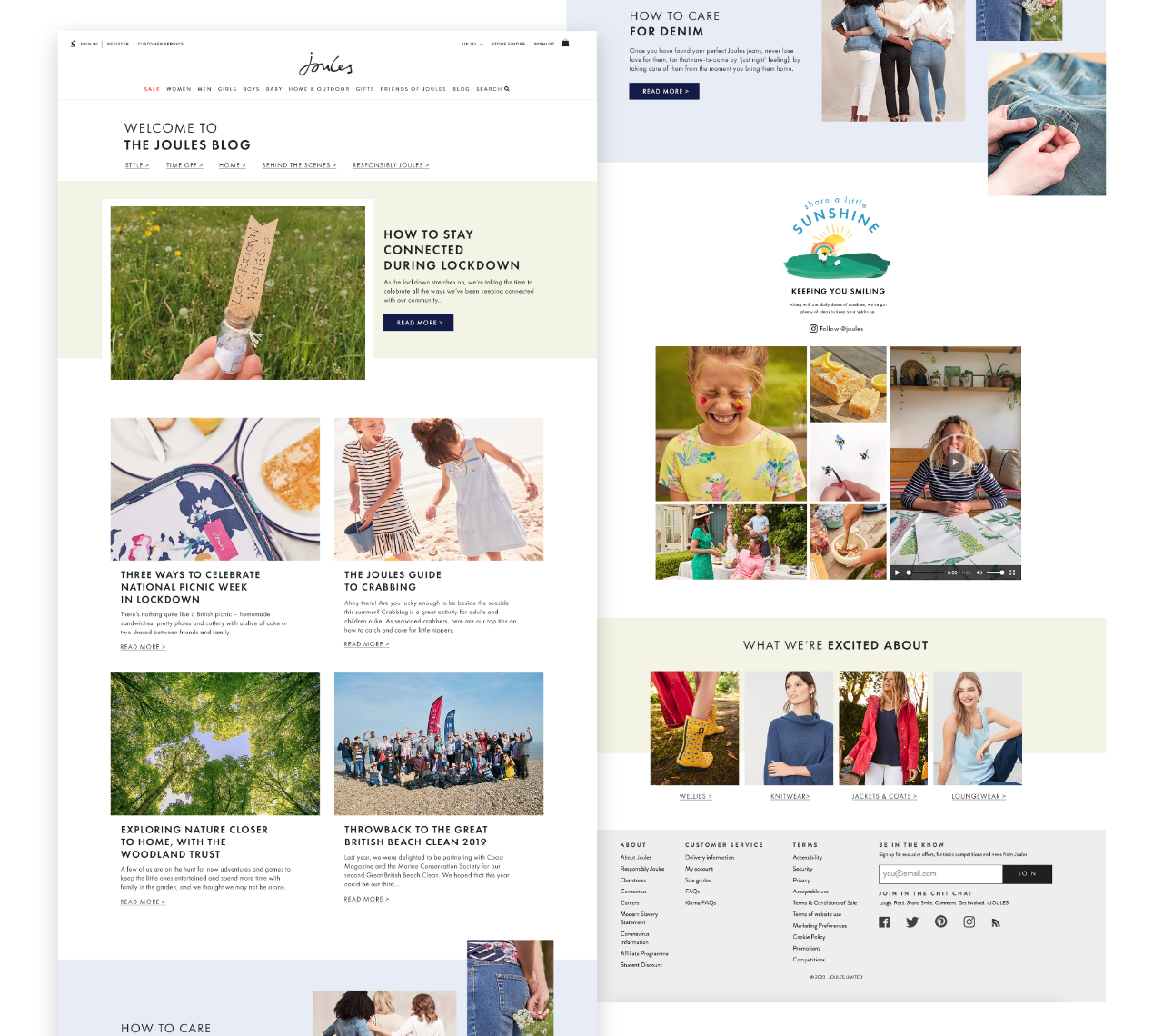 The redesigned 'Inspire Me' page.
 The process started with a little IA to determine what we needed to keep on the page—blog posts, product categories we're excited about had to stay - I also added a link to other high quality content with a secondary hero block (denim care currently) to improve SEO. I pulled out a blog post for a hero to give an anchor to the top of the page and allow for more focus on a specific post in future refreshes.
Likewise the blog post cards themselves were given more detail in an attempt to ensure a better user experience by having more understanding about a specific post before diving in. We retained the search feature but rather than a dropdown - it was replaced with a horizontal nav for better visibility and access below the H1.
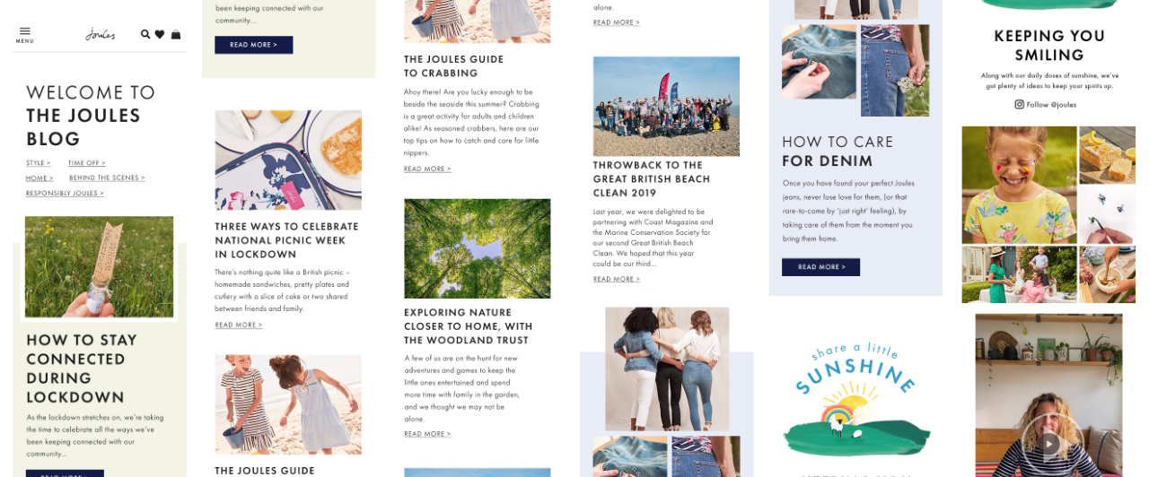 How the new page design looks at mobile resolution.
 The last page design in this collection, was to design an email sign up thankyou page which better reflected the brand look and feel for Joules. Using our talented illustrator Rosie's characters and landscape elements, I re-composited the illustrations to form the fun and on-brand scene below.
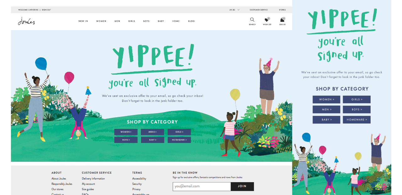 An illustrated thankyou page design.