Designing an E-commerce Store for Jewellery - Eclectic Charm
Let's take a look through the design to development process for this entire headless commerce site. The client runs a handmade jewellery site which was originally hosted with an all-in-one solution (Big Cartel), which worked well but lacked a strong brand element. They had some requirements for the new design: minimal / clean design, responsive, showcase large product images, improved UX and adding brand personality.
For projects like this the logical starting point is to comb over the current site and build a picture of the information architecture, then work back with the client to understand the current layout and work out if it can be improved. From this a sitemap usually comes together for the new design.
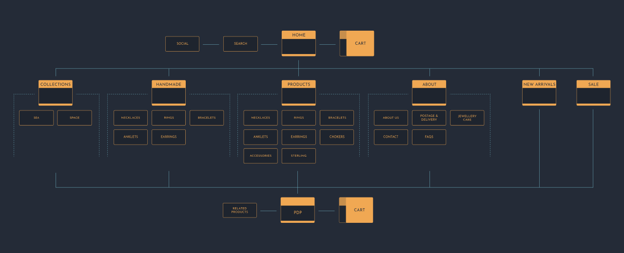 Information architecture for the new design.
 This provides a basic structure which can be built upon for the initial wireframes. The process for this is some quick and rough hand sketches, working from individual elements on a page and putting them together (a bit like a component set) before settling onto a few options to mock up in higher fidelity. Normally a selection of routes, 3 to 4, are presented for feedback and eventually refinement - before producing a final wireframe.
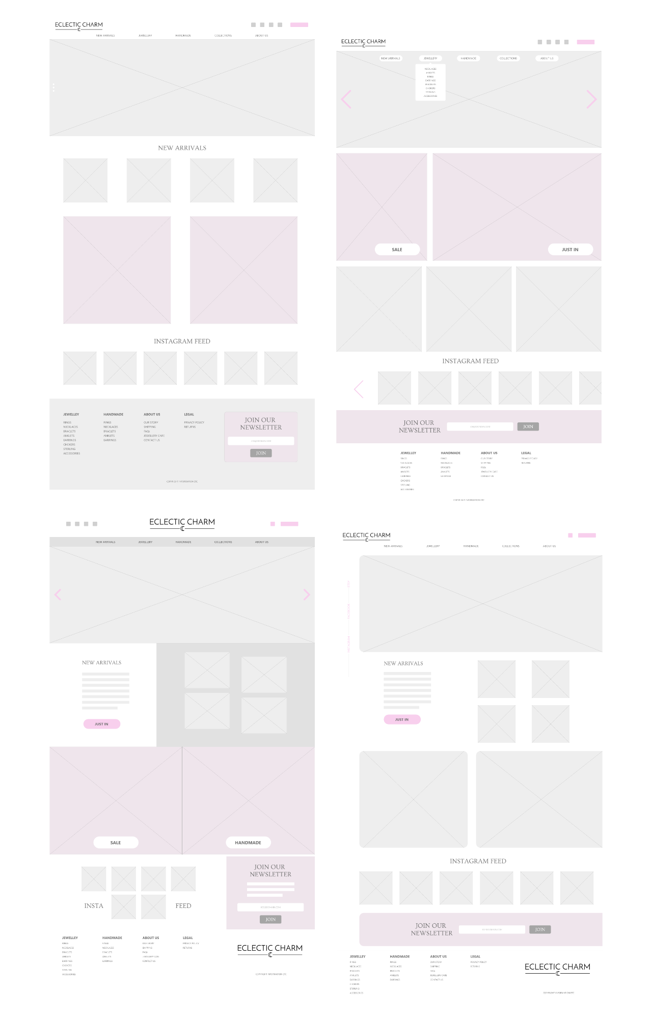 Four homepage variant wireframes.
 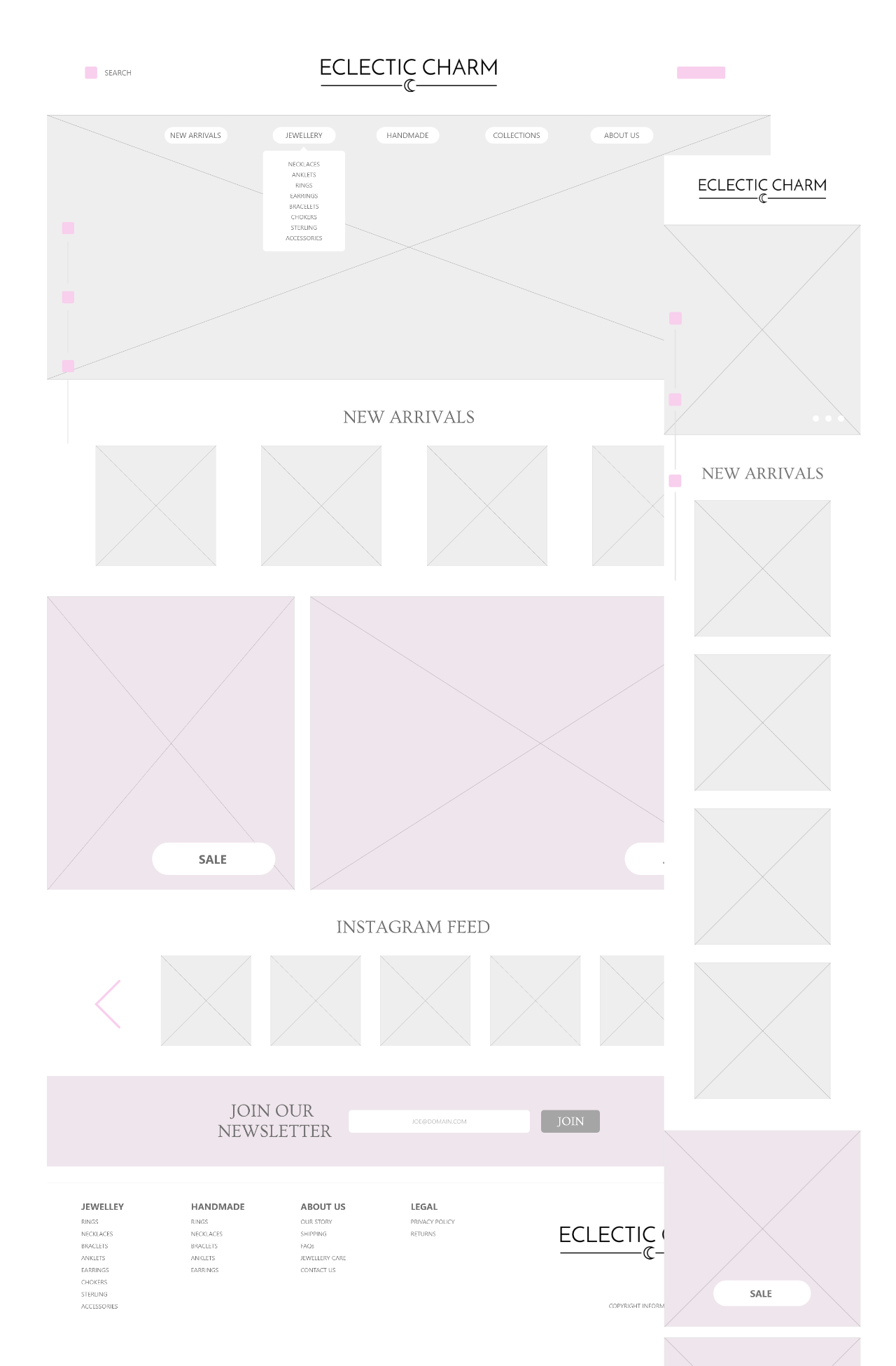 Settled homepage wireframe design.
 This method is then repeated for the most important pages within the sitemap and for this in particular it made sense to put a lot of thought into the Product Details Page and the UX involved in that. One of the defining details to achieve was to get across the delight in the product variants in a visual matter (as lets face it, dropdown selects are pretty uninspiring). To make this work, circular swatches were in place to make it easier and quicker to select a variant for purchase. Other screens that had some attention - the cart and menu.
 Product details page wireframes.
 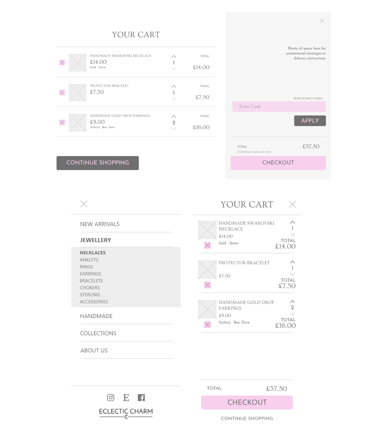 Menu and Cart explorations.
 From here - once the client was happy with the direction - the visual design started. The main process involved gathering a little bit of information about the brand; fonts, colors, imagery, etc. Compiling this into a mini style guide which could be used across the design and checking to ensure the colors passed at least AA contrast levels (they needed a litte tweak). Major page visuals were created for the homepage and product details.
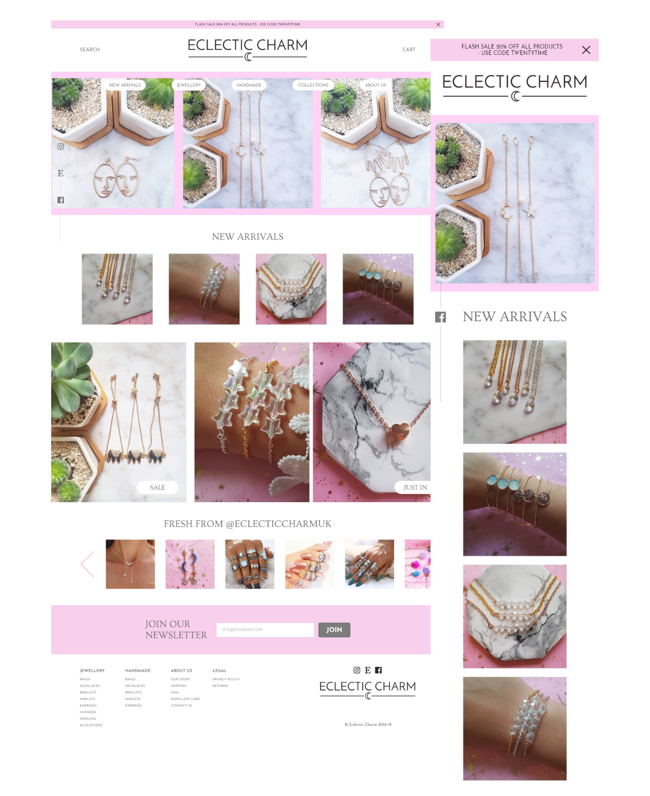 Visual design for the homepage.
 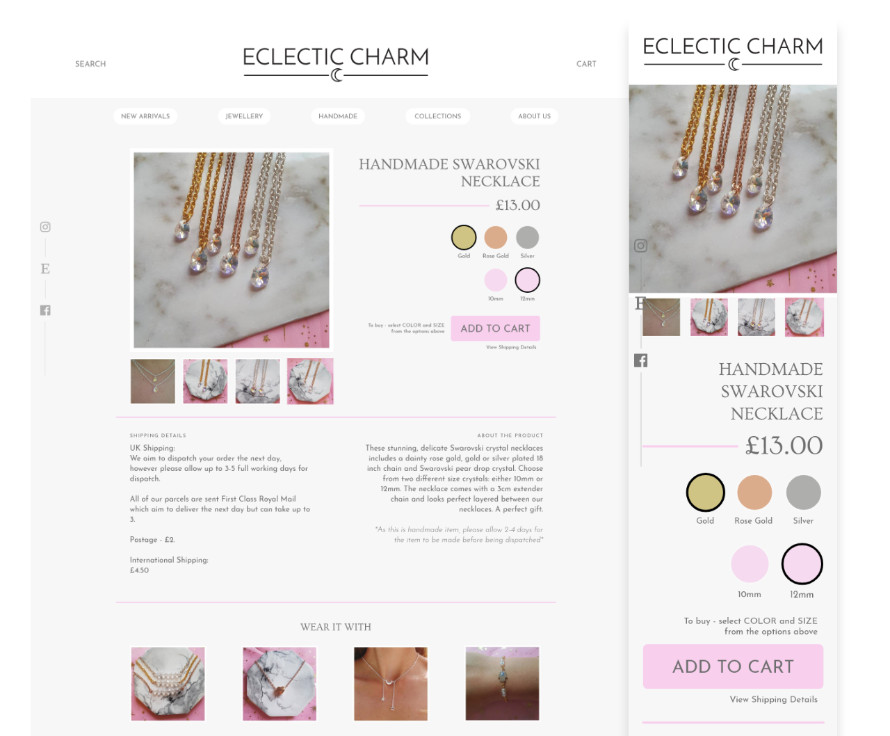 Visual design for the product details page.
 The next step post sign off - the build. The tech stack for the site is as follows; Frontend - Gatsby (React), GraphQL, HTML, Sass, all hosted on Netlify with forms enabled and automatic rebuilds with pushes to Github. Backend - Shopify Lite as the CMS with a zapier integration for form responses.
Moving the client to Shopify Lite helped to reduce the monthly costs from £20 down to around £7, which is a big deal for a small handmade business. Alongside this the site has increased custom functionality and page load speed was increased by a little under half a second. But the main positive was the client had a fully custom, branded store with full control for the future.
The detail for custom swatches on the product details page came to life but required a little bit of SASS list magic to work. The outcome made a visible difference which really gets across the detail in each product variant, hopefully leading to more engagement and easier product selection for orders.
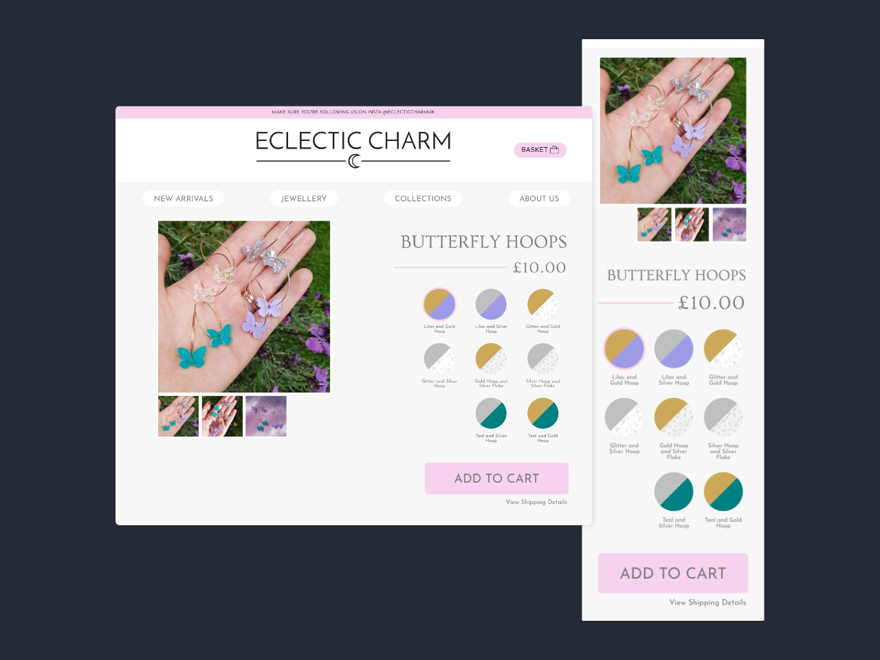 The built product details page with custom swatches.
 The site is live, eclecticcharm.co.uk, with version 1.0 launched, some details from above have changed in the process of development and initial launch feedback.