Designing the Blended Worlds Branding & Identity System
Blended Worlds are a company that tell stories and build worlds whilst helping others do the same. I helped to concept and define the brand from scratch, starting with setting out brand characteristics - Fantastical, Authentic, Pocket Watches & Monocles (think vintage), Refined.
From there I pulled moodboards to set the initial concept and designed a brand mark which encapsulated the characteristics, whilst having hidden semiotics within. The rest of the process involved building out logomark variants, selecting a color palette, typography choices and creating a set of guidelines.
Below are some of the guidelines and features of the identity system.
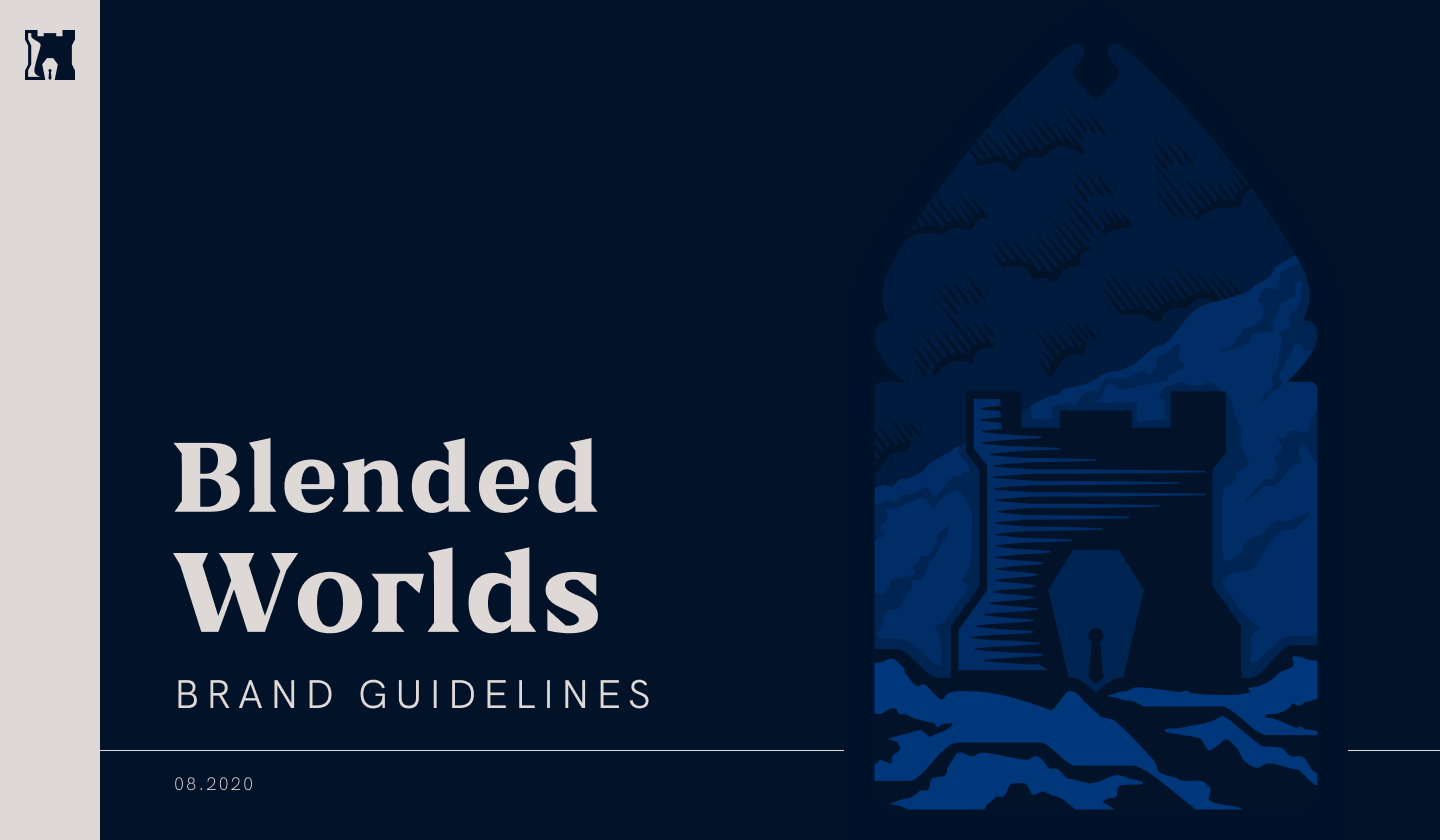 Brand Guidelines Cover Page.
 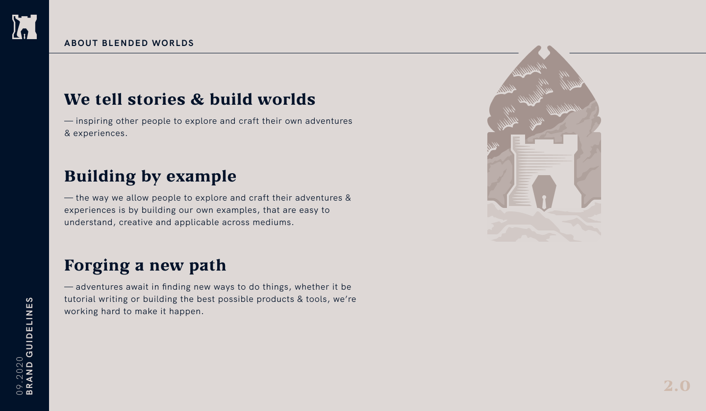 The core values of the brand.
 The main logomark for the brand was designed to be responsive from the outset, with three breakpoint sizes, at which the mark reduces/increases it's level of detail.
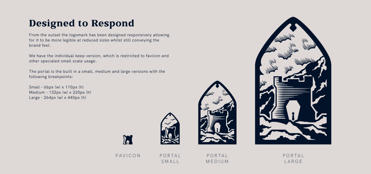 How the logomark responds in size.
 In the guidelines there are a collection of logo variants which were designed to make the brand as versatile as possible.
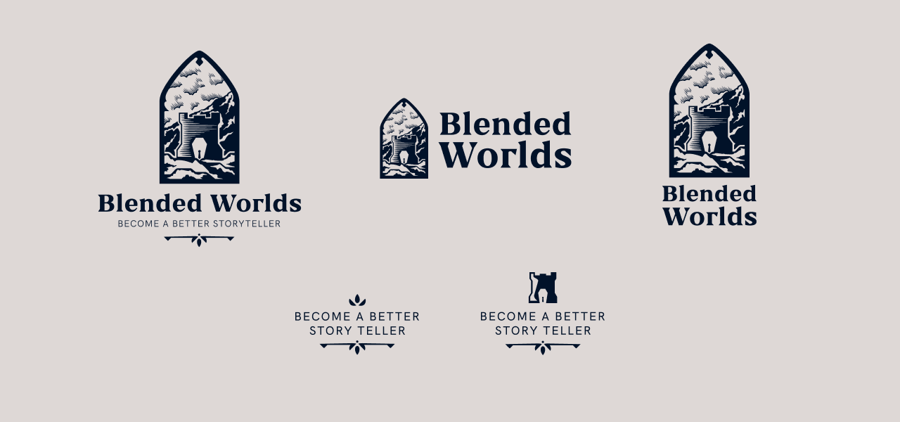 Blended Worlds logomark variants.
 One of my favourite parts of developing a brand is building the color palette - and for this brand, making the palette as accessible as possible was a must. The overall feel of palette is quite muted, earthy and from nature - the colors picked below all have an opposite counterpart which lands them into AAA contrast status for accessibility.
For this project I decided to take the accessibilty even further and build an augmented palette that takes the main palette and adjusts the values to account for colorblindness variants. This in the ends means that people with Protanopia or a similar visual state, will see a palette that much better reflects the true brand colors (although this is mainly only achieved in a digital realm).
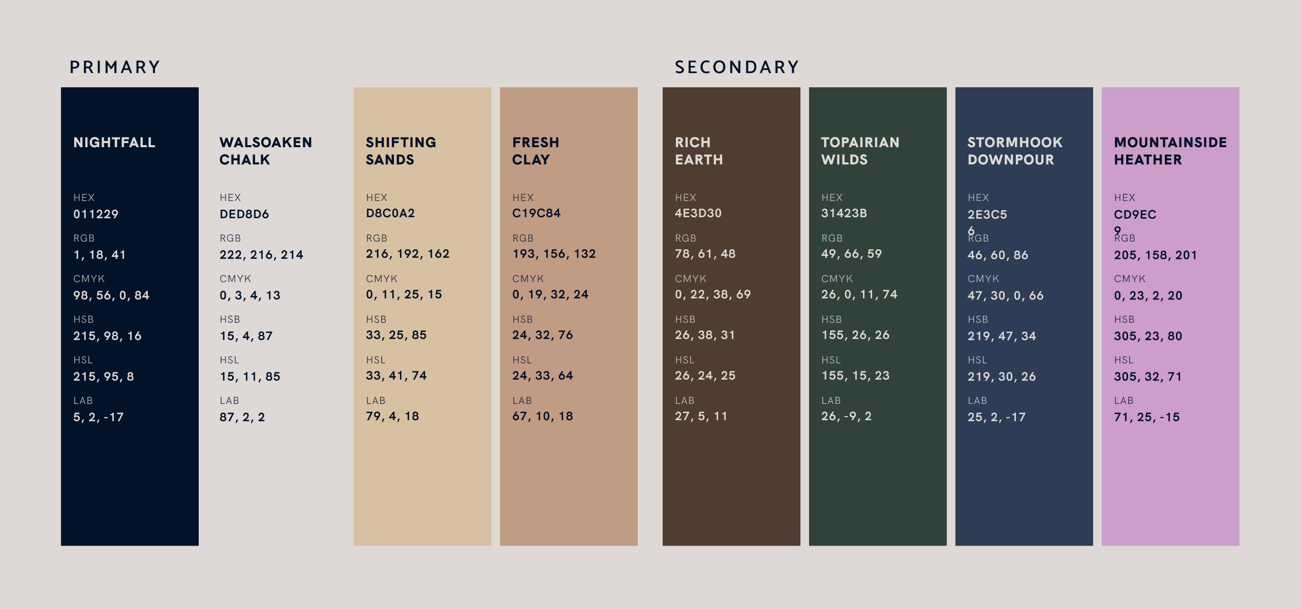 The chosen AAA contrast palette.
 When building a full identity system I like to add charcater to the brand with additional elements. For Blended Worlds a system of flourishes were crafted which could be move around and positioned together to create other elements of intrigue. These sorts of things are perfect touches to add to other brand collateral. Alongside this repeatable patterns always seem to be a useful addition to again bring the brand together further.
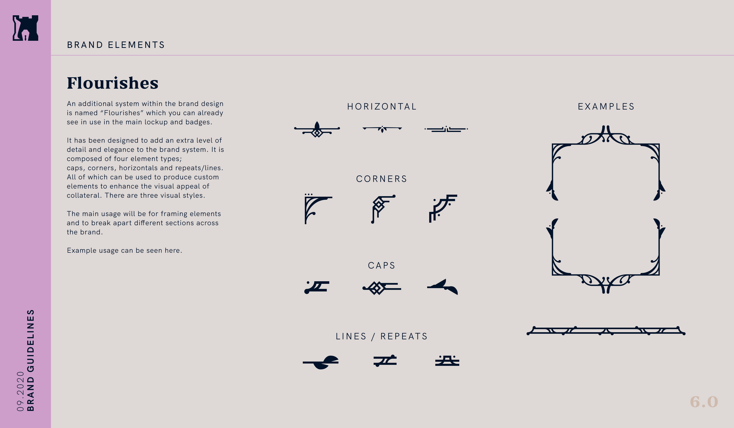 The flourishes system.
 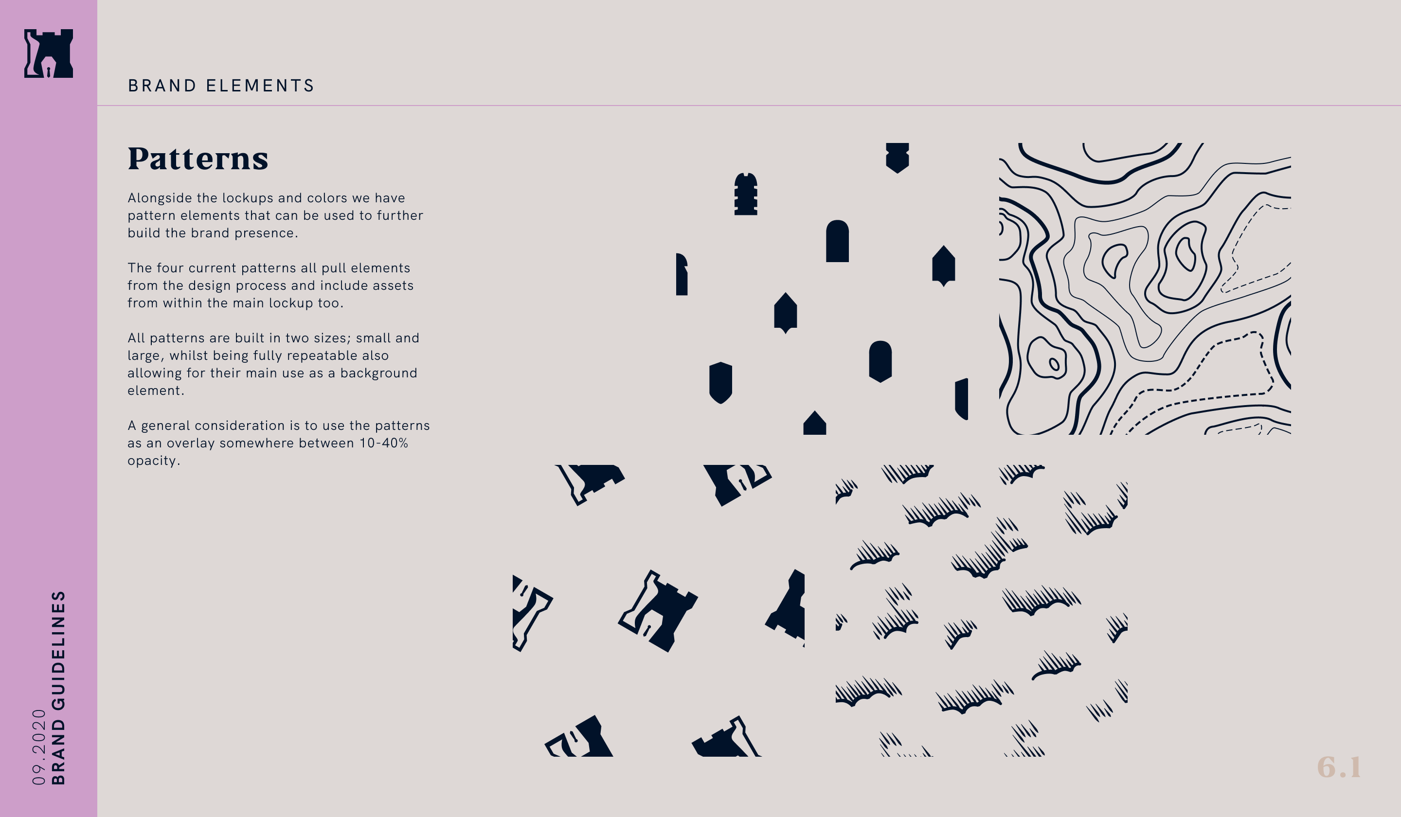 A collection of repeatable patterns for the brand.